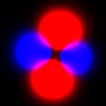
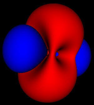
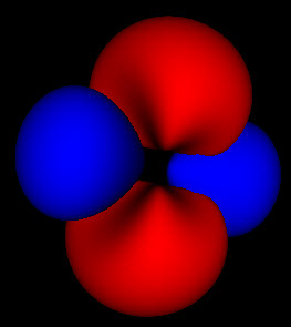
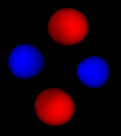
These are all images of the same electron orbital. The doughnut or torus shows the electron rotating around the central point in the orbital plane. In the standard terminology this has principal quantum number 2, which represents the energy level of the electron.
The azimuthal quantum number is 1. This represents how much of the energy of the electron is stored in rotating around the atom; in other words, it’s angular momentum.
The magnetic quantum number is 1 as well. This represents an electron spinning as fast as it possibly can given the momentum it has in a circular orbit.
The next image shows a standing wave mode of this orbital. This is where things get kinda weird. This mode is formed by two rotating waves moving in opposite directions. the (2,1,-1) and (2,1,1) modes.
This is where things get interesting. These wavefunctions are complex functions spread out through space. One of the basic assumptions of quantum mechanics is that the square of this wavefunction represents the probability that the particle will be found at that location. The 3 pictures above represent the same probability distributions sampled at different levels of detail.
Because these are probabilities there isn’t any fixed way to map them to a particular shape. The level set for finding an electron within a region 50% of the time can look much different than that for 80% or 99%. For the simple spherical distributions, they do look the same, but for higher energy wavefunctions the shapes get more complicated.
 My first attempt to view these functions was a simple addition of probabilities, which produced images like the one to the left. This image corresponds to the 4th image up top. As you can see this looks flat, and you can’t make out the links between the red blobs, the connections between them or the shape of anything. This is a somewhat more accurate rendering of the function, but it lacks all the features like shading, and solid form that our brain uses to give us clues about depth and shape.
On the other hand, the solid rendering hides the blurriness of these methods. Looking at the 3 pictures up top, you can’t tell by just looking at an individual picture how they are connected and what probability cutoff they represent. Looking at just static pictures is even harder.
So now that I’m no longer limited to the static shots on the web, or in a book, I’m seeing how these functions fit together. While the azimuthal part of the wave function is just a scaled cosine function, the interaction with the other dimensions of the wave function produce two different kinds of nodes. The first are the blue nodes that keep the simple blob shape even at very low thresholds. The other is the red nodes that have a dimple in them when they try to connect across the center of the torus at low thresholds. None of this helps me with calculations, but I feel like I have a much clearer view of what’s going on.
None of these pictures holds the whole story. Each one just shows a different part of the puzzle, and I’m sure there are many other ways to highlight many of the other features of these functions.


Leave a Reply